We’ve Rebranded! Here’s Why
- Jul 17, 2025
- 5 min read
Updated: Nov 21, 2025
Change brings some degree of apprehension to most people. Growth is nothing new to Advanced Client Care (ACC), as the team members are well-versed in it. Our daily work at ACC involves helping clients through growth.

We needed to apply our expertise to our brand, as we follow the same principles in helping our clients through their transformation processes. Our team spent many months in combined reflection and creativity before unveiling the new Advanced Client Care rebrand and redesigned website, which represents our authentic mission, caring approach, and future direction.

Why Now?
The co-founder Nicole Albanese Bell of Advanced Client Care expressed that the company had experienced tremendous personal and professional development. Our brand, together with our website, had not kept pace with the expansion. The visual appearance failed to show the depth of intentionality and personal connection that defines our entire practice.
This discovery prompted an extended period of realignment between our visual identity and digital presence and the mission and values we have consistently maintained as a provider of holistic mental health care that starts and finishes with authentic human connections.
That realization sparked a months-long journey to realign our visual identity and digital home with the mission and values we’ve always stood for: holistic, human-centered mental health care that begins and ends with real connection.
Cedric Bell, co-founder, added, “We care deeply about our clients, and we wanted the look and feel of ACC to show that, to make people feel supported the moment they found us.”
Partnering with Peak Nye: Bringing Vision to Life
To bring this vision to life, we partnered with Nairim Villarreal aka Nai (Nye), the founder and creative director of Peak Nye LLC, a marketing agency that specializes in brand storytelling and digital design.
From the start, Nai approached the project with deep care. “My goal was to visually and emotionally align ACC’s brand with the incredible work they’re already doing,” she said. “This wasn’t about reinventing who they are; it was about revealing it more clearly.”
Through thoughtful strategy, design, and collaboration, the new brand and website took shape, reflecting ACC’s warm, supportive, and professional energy every step of the way.
The Logo: Symbolizing Transformation
At the center of our new brand is a logo that tells a story. The updated symbol features a head silhouette with a blooming lotus, a combination that speaks directly to ACC’s core purpose.

“So much of our process happens in the mind, where we get stuck, where we heal, and where deep connection begins,” Nai explained. “The head silhouette acknowledges the centrality of mental health, while the lotus, a symbol of resilience and rebirth, reflects the transformation that therapy can offer.”
Nicole added, “We didn’t want to lose the lotus from our old brand; it meant something. But this new version speaks more clearly to who we are and what we offer: compassionate care, mindful transformation, and support through every stage of growth.”
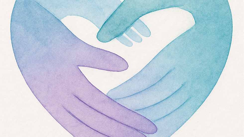
A Color Palette Designed for Connection
The inviting palette of purples, teals, and blues was handpicked by our designer to support ACC’s approachable and calm presence. The colors move away from the solitary dark blue of our previous brand and instead invite balance and emotional depth.
“These colors were chosen to evoke trust, warmth, and clarity,” said Nai. “Purple reflects compassion and insight; teal invites openness and healing; and blue provides grounding and stability.”

For Cedric and Nicole, the result was instantly recognizable as a better fit.
“It finally feels like we look on the outside the way we’ve always felt on the inside,” Nicole said. “It’s welcoming, it’s clear, and it’s real.”
Our Tagline: Healing Begins with Connection
At the heart of our new identity is our new tagline: Healing Begins with Connection. It’s not just a phrase; it’s the foundation of everything we do.
“We treat every person like they’re the most important client because they are,” Nicole said. “We don’t push people through automated systems. We respond. We listen. We connect.”
This philosophy extends beyond our clients. It’s how we treat our clinicians, our admin team, and our partners. Cedric put it this way: “Connection is our north star. If we stay anchored in that, we know we’re doing it right.”
The Website: A Digital Home Worth Visiting
We knew our site needed to do more than just exist; it needed to serve. It needed to feel like a calm, helpful place to land, especially for people in vulnerable moments.
“Our old website was functional, but it didn’t feel aligned with the professionalism and heart behind our work,” said Nicole. “Now it does.”
The new website offers:
Easy navigation for clients, therapists, and partners
Clear, friendly language that reflects our voice
A streamlined contact process, no friction, no waitlists
A new blog and resource center for learning, support, and inspiration
Nai also made sure it was optimized with SEO in mind, so more people searching for meaningful, accessible care can find us.
“We wanted people to feel clarity, not confusion,” Nai shared. “And to know they’re in the right place the moment they arrive.”
Reflecting Our Founders’ Story
One of the most powerful aspects of this rebrand was grounding it in Nicole and Cedric’s personal journey.
“We created ACC because we’d both seen what happens when systems put profit over people,” Cedric said. “We wanted to build something better, a place where clients feel supported and clinicians feel respected.”

That vision is now fully represented, not just in the services we offer, but in how we show up online, in print, and in every interaction.
“I wanted the brand to feel like them,” Nai said. “Not just pretty, but rooted in authenticity. You can’t fake care, and ACC doesn’t.”
Community Feedback: The Warmest Affirmation
Since launching the rebrand, the response from clients and community members has been overwhelmingly positive.
“The new site feels like a breath of fresh air,” one client shared. “I feel welcomed just by looking at it.”
Another therapist commented, “I’m proud to be associated with ACC now more than ever. This new look matches the quality and care I’ve always known to be true.”
For Nicole and Cedric, those comments affirm that the decision to evolve was the right one.
“We were scared,” Nicole admitted. “But we trusted the process, and now it feels like home.”
Looking Ahead: A Foundation for Growth
This rebrand marks a pivotal chapter in our journey; not as a departure, but as a rebirth.
We’re reaffirming our commitment to:
Expanding our services across the East Coast
Welcoming more aligned therapists into our team
Partnering with communities and businesses to offer accessible, culturally competent care
Providing resources that educate, uplift, and empower
“This isn’t the end of anything,” Cedric said. “It’s the beginning of something even better.”
In Three Words?
Transformative. Insightful. Rebirth.
That’s how Nicole describes this new phase, and we couldn’t agree more. We’re proud of where we started, excited about where we’re going, and grateful for every person who’s walked this path with us.
Explore the New ACC
Whether you’re a client seeking care, a therapist looking for a values-driven home, or a community member cheering us on, thank you for being here.
Take a look around. And when you’re ready...
Because healing begins with connection, and we can’t wait to connect with you.


Comments